|
|
VLAB Home |
|
Panel Editor is a mode within Panel Manager which allows the user to edit the panel definition file interactively. The panel items are objects that can be created and moved on the panel. New panels can be created and existing panels can be edited.
To edit a new or existing panel, open Panel Manager with optional filename argument.
> panel [optional_filename]
Creates a new panel, with optional file name.
> panel [panel_definition_file]
Opens existing panel.
When Panel Manager opens, the default mode is Execute Mode (refer to Panel Manager: Display, Menu and Mode).
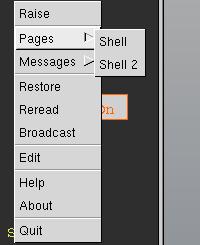
To invoke the Panel Editor, activate the popup menu by pressing the right mouse button anywhere on the panel and select Edit (see figure 1 below).
|
|
|
Figure 1 - The popup menu in Execute Mode. |
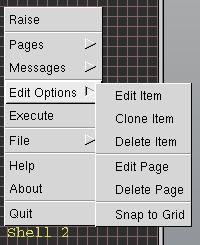
Figure 2 - The popup menu in Edit Mode, and the Edit Options sub-menu. In Edit Mode, the grid is shown on the panel. |
The popup menu in Edit Mode differs from the one in Execute Mode. The popup menu contains options specific to editing. The popup menu is activated by pressing the right mouse anywhere on the panel.
The following tables explain each option in the popup menu.
| Raise | Always appears at the top of the popup menu. Its function is simply to bring the panel window to the front of the other windows on the screen. |
| Pages* | If multiple pages are defined in the panel definition file, the Pages sub-menu will allow the user to move between panel pages. |
| Messages* | If there are menu items defined in the panel definition file, they are available in the Messages sub-menu. When a menu item is selected, its message is sent to stdout, like for other panel items. |
| Edit Options | The Edit Option sub-menu. See table 2 below. |
| Execute | Close the Panel Editor window, and switch to Execute Mode. A different set of menu options are then available (refer to Panel Manager: table 1). (Note: Does not save the panel definition file.) |
| File | The File sub-menu. See table 3 below. |
| Quit | Close the Panel Manager and Panel Editor window. If the panel has been modified, inquire as to whether or not to save. |
| Edit Item | Open the panel item dialog which allows the user to edit the items properties, such as name and colour (disabled if no item on the panel is selected). |
| Clone Item | Clone the current panel item (disabled if no item on the panel is selected). The cloned item is just like the original, except that it is located at the origin (lower left corner) of the panel. |
| Delete Item | Delete the current panel item (disabled if no item on the panel is selected). |
| Edit Page | Open the page edit dialog for the current page. |
| Delete Page | Delete the current panel page (disabled if no page is selected). Does not affect the remaining pages. |
| Snap to Grid | Toggle snap to grid mode, in which the bottom left corner of panel items will align with the nearest grid intersection as the item is moved. |
| Load | Open a file dialog box to browse the users directories for the panel to load. |
| Reread | Reread the last saved panel definition file (all changes since last save will be reverted). It is necessary to reread the file if the colourmap has been edited, or if the file has been edited manually with a text editor. |
| Save | Save the panel definition file. If the panel definition file has not been given a name, a file dialog will inquire for the new panel file name. |
| Save As | Open a file dialog to input another filename to save the panel as. |
The panel can return to execute mode in the following two ways:
The Panel Editor is a separate window which interacts with the panel. A 10x10 pixel grid is drawn over the panel, to aid with design and alignment.
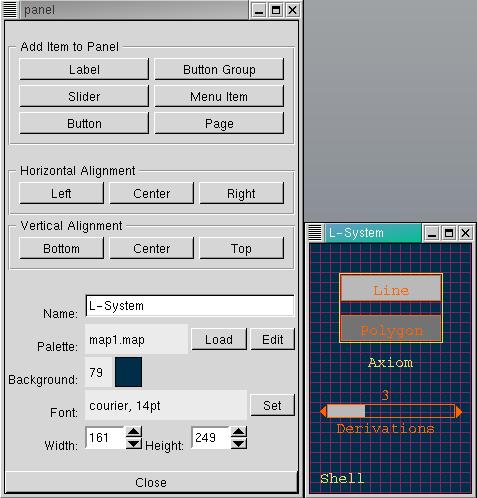
The panel editor can be divided into three main sections:
The following panel fields may be edited:
| Name | The panels name can be typed in the edit box. The name is displayed in the panel window caption. It is not the same thing as the panel file name. |
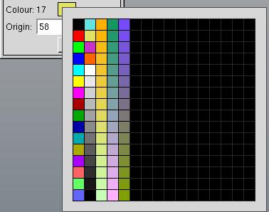
| Palette | A 256-entry RGB colourmap can be loaded by left clicking the button marked Load. The colourmap can be edited with the VLAB Palette Colourmap Editor by left clicking Edit. (See also Loading a Colourmap and Selecting Colours). |
| Background | The background colour can be set using the Popup Palette (only if a colourmap has been loaded, otherwise defaults to black). (See also Loading a Colourmap and Selecting Colours). |
| Font | A font for panel text can be specified by left clicking the button marked Set and selecting from the font dialog. |
| Width / Height | The width and height for the panel can be entered into the spin boxes, or the panel can be freely resized. When resizing smaller, be cautious that all items on all pages remain within the panel bounds. |
Labels, sliders, buttons and button groups appear on the panel. Their contour is defined as the rectangular border around them and their origin is defined as the bottom left corner.
Pages and menu items appear in the panel's popup menu
The panel origin (0,0) is defined as the bottom left corner. All new items appear with their origin at the panel origin.
A colourmap can be loaded by clicking the Load button, located to the right of the label marked Palette:, and browsing for the colourmap file.
| Note: | If no colourmap is loaded, or if the colourmap does not exist, default colour settings are used (refer to Panel Manager: Figure 2 for an example). |
A colourmap can be edited with the Palette Colourmap Editor. Click the left mouse on the Edit button to open Palette with the panel's colourmap. If the colourmap is edited the panel definition file must be reread, by activating the popup menu and selecting Reread from the File sub-menu.
| Note: | Save changes before selecting to Reread. |
Once a colourmap is loaded, the background and item colours can be set using the Popup Palette (shown in figure 4 below). To activate the popup palette, press the right mouse on the coloured square located to the right of the label marked Background: or Colour:.
Then, drag the mouse over the palette until the desired coloured square is highlighted in white, and the desired index appears in the label Background: or Colour:.
An items edit dialog can be invoked by:
An items editable fields may include the following (not all items include all fields):
| Name | The items name can be typed in the edit box. |
| Colour(s) | If a colour palette has been loaded, the colour can be selected by pressing the right mouse button over the colour swatch and selecting a colour index on the popup palette. If no palette is loaded, or no colour is selected, the label beside the colour swatch displays a dash (-). Otherwise, it displays the colour index between 0 and 255. The first colour is the outline/text colour. The second colour (if it exists) is the activation colour. The third colour (optional, and for buttons only) is the inactive/off colour. |
| Origin | The items (x,y) origin is displayed and may be edited in spin boxes. |
| Min/Max | The range of sliders can be defined. The minimum value MUST be less than the maximum value. |
| Value | The initial state can be defined for buttons and sliders. |
| Message | The message that is sent upon activation in execute mode must be specified. As a reminder, the default message is: d <name> %d <scale> |
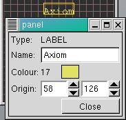
A labels editable fields include: name, colour, origin
See table 5 for more details.
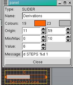
A sliders editable fields include: name, colours (2), origin, min/max, value (between min and max), message
See table 5 for more details.
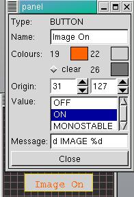
A buttons editable fields include: name, colours (3), origin, value (on,off,monostable), message
See table 5 for more details.
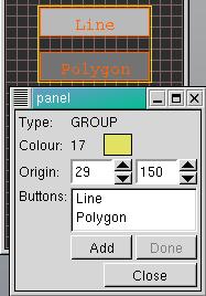
A button groups editable fields include: colour, origin, buttons (list of names)
See table 5 for more details about colour and origin.
Buttons can be added to a button group by left clicking the button marked Add and then by selecting the button items on the panel. When adding buttons to a group, only button items are selectable on the panel.
Left click the button marked Done when done adding buttons.
| Note: |
Buttons must have unique names, or they cannot be added to a group. |
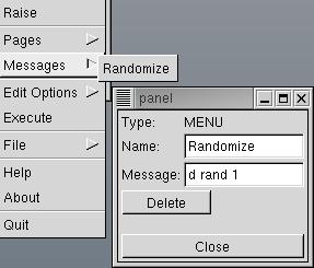
A menu items editable fields include: name, message
See table 5 for more details.
| Note: |
The only way to delete a menu item is by left clicking the button marked Delete on the menu item edit dialog. |
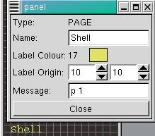
A pages editable fields include: name, page label colour, page label origin, message
See table 5 for more details.
A pages name appears in its label. All pages have labels, and page labels cannot be deleted, although they can be empty.
If a page name is empty, it is refered to in the popup menu by its number in the sequence of pages in the file (eg. 'Page 3'), but no corresponding label is displayed on the panel.
The Panel Manager and Editor requires a specific file format for the panel definition file.
There is no specific format or extension for the filename, but a convenient convention is to name the file "panel" and use the same extension as the data file it modifies (for example, panel.l).
Refer to Panel Manager for more documentation about file format.
|
|
VLAB Home |
|