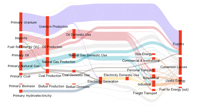
Energy systems encompass the generation and conversion technologies as well as the distribution network which provide energy services (mobility, comfort, light, nutrition, industrial products, etc) from the energy sources that nature provides. Examples of energy sources include the fossil fuels(coal, oil and gas), uranium and renewables (hydropower,biomass, wind, solar). These energy sources are converted into commodities or currencies (e.g., gasoline, diesel, electricity, wood pellets, etc) that can be moved to where the energy is needed to be converted into a service. Some of the elements that form energy systems are the energy flow inside a region, production levels for energy sources, trade of energy across regions and also other attributes such as amount of green house gas (GHG) emissions produced through out the process of energy generation to delivery. Following image represents Canada's Sankey diagram in 1978.
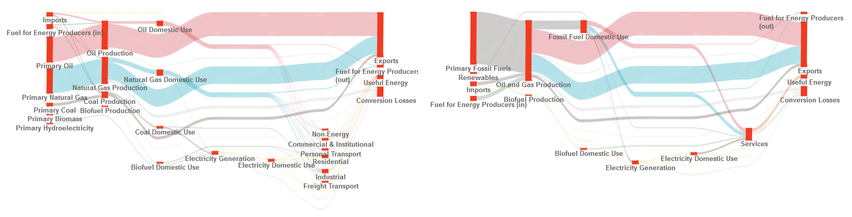
Sankey diagrams are a common means used to show the magnitude of energy flows from resources, through commodities to services. These diagrams provide a top-down perspective on energy systems and make it possible to identify major features, inconsistencies or questionable aspects of the data that require closer and critical analysis. A Sankey diagram arranges nodes in layers based on the incoming and outgoing edges. In energy systems, resources are usually placed on the leftmost layer and services are on the rightmost layer. In typical Sankey diagrams, edges are represented by a smooth curve where the thickness represents flow quantity. Following image shows a Sankey diagram in two different levels of detail.
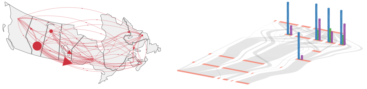
In this project we build a visualization tool that provides an interface for exploring time-varying, multi-attribute and spatial properties of a particular energy system. The tool integrates several visualization techniques to facilitate exploration of the energy system. These techniques include Sankey diagram representation to show energy flow, 3D interaction with Sankey diagrams for expanding viewable data attributes such as emissions and an interactive map integrated with flow diagrams for simultaneous exploration of spatial and abstract information. We also perform level of detail exploration on flow diagrams and use smooth animation across the visualizations to represent time-varying data. In the following image, (left) is a flow map and (right) is the emissions shown on a Sankey diagram.
Team
- Haleh Alemasoom, MSc student
- Faramarz Samavati, Research lead.
Downloads
A demo video of our visualization tool can be found here.